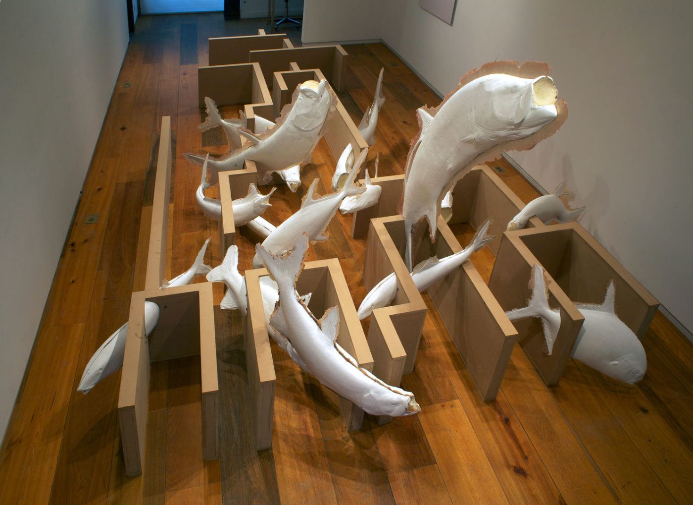
Artist David Brooks shares his fascination with the natural world by volunteering in biological expeditions. He utilizes these opportunities as excuses to go out into nature and get physical contact with the research being conducted by the scientist, in order to see evolution itself. This fascination with living allows him to acquire an understanding of the processes needed in order to properly document and research the biodiversity of the world. In this particular case, he took part in an expedition, looking for armored catfish in the Amazon. Being part of this group of scientists he talks about how everything from the geographical history of the area to the cultural interactions on the native people with the rivers, has affected the evolutionary distinction in the mandibles of this particular catfish species. Such an extensive process for him to partake, in order to gather information to then talk about the way in which artists and scientists view and interact with the natural world. the very impressive task to take part in just to get an understanding of concepts to then make artwork related to these ideas.
My name is Camilo Pico, as an Art student at the California State Univercity Sacramento, I will be talking about contemporary art works and art shows. Analyzing them and giving my views in order to better understand where the art world is in my generation and to better understand my views in this fast pace art scene that we currently live in.
Friday, May 1, 2020
Diana Thater
Diana Thater is an activist and artist that focuses on the way living creatures are treated by humans. She has spent some time preventing the sale of cetaceans, marine mammals like whales and dolphins, to amusement parks. She speaks about the politics in her art and the politics of activism, she says mixing them will make them muddle. Preferring the subtlety of politics in her art. Speaking about film and documentation of animals she mentions that a film or photograph of an animal without narrative is a problem, because one image after another looks great but it lacks substance. In her work, she attempts to involve the viewer in the world of the creature being presented. Stating that the feeling being created by the projections in the surroundings of the viewer will be enough to create a lasting emotion. She displays projections of footage of an animal in a way that surrounds the viewers into the world of the creature. A direct contrast to zoos, which encage creatures in human surroundings. She talks about how sad zoos are since the confinement of these animals makes them psychotic. Even with the best treatment and proper nutrition, this confinement gives off a horrible view of the human treatment of animals. Thater speaks about her work as an activist, how can she translate these actions to make artwork that will leave a feeling. This feeling she talks about will grow into change, change in the human mind, and subsequently change in the issue presented. She believes that once the viewer contemplates the beauty of this world, they will recognize and acknowledge all other living creatures through a sympathetic adventure. Which will better conditions not only for the animals but for humans as well.
Neukom Vivarium
Mark Dion. Neukom Vivarium, 2006. Mixed-media installation, greenhouse structure: 80 feet long.
Mark Dions installation talks about the significance of ecological preservation. But most impressive is the length by which he goes to show how hard it is to do all the things the natural world does. In this immense project Dion and his team which consists of many other fields of study like scientists, architects, construction workers, and many more. Tackle the task of removing this dead tree and placing it in the middle of the Seattle streets to show the people how hard it is to maintain life. In this case, the many plants and organisms that live on and around the tree, because of the tree. Complex irrigation systems, as well as lighting, shading, temperature, and humidity, controls needed to be designed to try to maintain this ecosystem alive. The entire design of these mechanisms is exposed and done in a very elegant way to show the viewers as they walk through the vivarium how much it takes and how we take for granted all these natural processes. Please check out the short documentary of this very interesting project at the link below.
Tuesday, April 28, 2020
Bay Area Exhibition Review
I visited the Minnesota Street Project before the shutdown and had quite a pleasant experience, it was a different style of gallery/galleries. Being an actual warehouse with resident artist and sectioned off gallery spaces, where the artist would allow another artist to show their work in a professional setting. At the main entrance of the Minnesota Street Project complex, I come across the first gallery. The entirety of the buildings’ first floor is the gallery and at the time was showing works by Nicola Roos. Spaced several feet apart and in their own little square pedestal sit life-size sculptures of what appear to be traditional samurai outfits on a mannequin. Upon closer inspection, it is clear that the figure uses life castings for the face and extremities. But the biggest shock is how the traditional samurai armor is created. Using several different materials and mixed media, the artist creates a realistic rendition of the suit of armor. Materials like bike tubes, foam, glass, beats, and rope are some of the ones used to create the attire. The more that I observe this figure the more alive it seems. The sculptures sit still but have a particular stance to them, not sitting perfectly still and straight-up but rather with a very subtle contrapposto. Frozen in time these statues have a dark, menacing feel to them. The expression on the faces of the figure is peaceful, with eyes close and a resting face. But the dark colors and heavy-looking armor create this sensation of the figure waiting to be awakened. With a total of 5 figures spread across the gallery floor, the viewer gets to sit and watch each sculpture in a personal space. Away from the other sculptures, the viewer has a complete 360-degree uninterrupted view of the piece. This contrast between the detailed dark figures and the white walls and light concrete floor place the sculptures in complete isolation and almost creates a kind of void for these particular pieces. The gallery being in the complete open center of a warehouse creates a challenging job for the artist to presents it’s work, as it must sustain itself surrounded by a continuous flow of foot traffic, this type of open space galley surrounded by more galleries within the same building was new for me but it was a quite enjoyable experience.
At the Elanor Hardwood Gallery, a show by Kira Dominguez Hultgren is showing. The small space is well covered by the stretched out tapestry-like sculptures. The artist has created these intricate textiles which are quite large and some even cover the entirety of the wall. The artist uses ratchet straps to stretch out the textiles across the gallery walls. At first, this was the only thing that caught my eye. My complete attention was dedicated to how the artist had displayed this work. One particular work was troubling for me as the ratchet straps where bright orange, even if they were a different color it was clear that the artist had made a decision to display the large works with this obvious method. The reasons as to why I couldn’t figure out, but for the most part it went along with the pieces as the piece itself was very organic and natural-looking. In contrast to the more rigid and geometrical look of the ratchet straps. But I kept finding my way back to the one-piece that just didn’t feel right. This particular piece had an extra element in it, wood. The long wood pieces that were part of the fabric looked like a frame. Running along the edges of the fabric woven into the entirety of the piece these wooden lines created that rigid industrial feel. But then they were also the part of the piece in which the ratchet straps connected it to the wall. My fascination for how the work was displayed may have distracted me from the overall gallery itself, but it does a good job of creating tension, and almost pointing at the stretched fabric. The intricate woven fabrics get highlighted by the neon orange straps, that serve the job of not only creating physical tension that hold the piece up but also points at it in a very direct and arrow-like fashion.
At the Nancy Toomey gallery, an exhibition by Gregg Renfrow was showing. This larger gallery had paintings in the series “Closer to the Water”. The paintings are color full, with a large variety of colors varying from painting to painting. But there’s something very peculiar about these paintings as the brush strokes or rather lack of them are very clear. The entire canvas looks like it was painted in one clean sweeping motion. The artist ha intentionally created this effect by which the different colors blend and into one clean stroke that covers the entire canvas as if they were placed perfectly all at once. The image itself shows a lot of light, using white and vivid colors the painting places a type of foreground, middle ground, and background. An abstract landscape I would call it. The images are symmetrical on each side, not perfectly symmetrical at the brush stroke pattern has its natural differences in each side but from left to right the are symmetrical in color. With a white line cutting the image down the middle from top to bottom. This dissection of the image is quite strong and creates that feeling of light. Although all the paintings vary drastically in color and use of pigments in the image with some being mostly white, all of the images are very similar in their composition. The large canvases were placed vertically and looked almost monolithic. The image is split down the middle also made it feel like a doorway. With this line that was in most painting an array of white light almost like an extremely bright sunrise, the images were creating a sensation of landscapes but in an alternate universe. Or a type of breaching into a new dimension. It also reminded me of all too familiar scene of the light at the end of the tunnel.
In the Anglim Gilbert Gallery, the artist by the name of Carter was showing work in the series “Didn’t we almost have it”. Various different images were displayed in this traditional medium size gallery. The drawings by carter where very intriguing as some would have bacteria like characters whit human facial features and expressions. While others would have repetitive colorful symbolism stamped over black and white charcoal drawings. The title is very descriptive and hints at some kind of human condition. The images portrayed back up this idea of human error or should we call it a crisis. The drawings with the bacteria like figures sticking their tongue out are kind of a mockery of the image to the viewer. While the ones whit this colorful symbol over the charcoal drawing of something traditional like a landscape or a ship at sea feel more like a representation of overtaking. What I mean is that the image is being highjacked taken over by these bright bold colors in this repetitive shape, almost like an illness spreading throughout the image. As playful as the color and placement of paint drops and streaks may seem I get a far more somber feel from these paintings. The action of painting over a specific drawing seems aggressive as it is now to be overwhelmed by color and what seems to be random symbols and patterns adds more impact to it. The contrast between the black and white charcoal painting and the bright color is huge, but it makes me wonder exactly what the artists’ intentions are for these graffiti-like patterns covering up the majestic style of drawing behind them. To be it is a progress in time from the old to the new, the traditional to the modern, light vs dark type of thing. Following this idea of the progress, I refer back to the title as it tells me that there is something the artist isn’t satisfied with. The kind of idea that tells me these works are political if not very directly talking about something that could have happened or could have changed but “we” blew it. The whole gallery was filled with very intricate and interesting images and it created a very dynamic experience when going from painting to painting, each telling their own story talking about the same concept.
Soul of a Nation
At the Soul of a Nation exhibition in the de young museum in San Francisco, Ca.
One of the most powerful pieces of art was this Sculpture by David Hammons. The simplicity mixed with the choice of material creates a powerful and sticking image that you could smell and almost taste.
One of my favorites at this exhibition, once again because of the choice of material and its simple yet striking final form. The delicacy of the rips in the nylon is impressive to me but most importantly it is the tension that is created by the stretching. This physical tension becomes emotional tension giving the topic at hand.
This image shows how far the tension of the nylon goes and how such display makes the piece that much more impressive.
Charles Alstons Black and White #7 is to me, one of the most powerful paintings at the Soul of a Nation exhibition. As the first thing that came to mind when I saw this piece was the idea of colonialism. The white paint symbolic of European conquistadors taking over the canvas and surrounding as well as painting over what little black pigment we see in the canvas. The use of directional brushstrokes, as well as overlapping, is what created this feeling fro me. The black pigment symbolic of indigenous people. It is clear that the white has taken over the majority of the canvas and the black paint is being consumed and overrun by it.
One beautiful print!!!
Tuesday, April 7, 2020
Recent works by Patrick Crouch
A student at Sac State Patrick Crouch creates an interesting exhibition surrounding the human consumption of animals. Given the current time, the condiment of our homes I can't help but relate to this exhibition which was open prior to the lockdown in California, to the current events taking place. The artist here creates very bold and direct content about the meat production industry and how the mass consumption of these animals leads to one golden nugget, a symbol for what humans desire disregarding the cost that it takes to mass-produce.
Creating powerful images whit simple black shadows of the figures being processed through an assembly line style of a factory. Patrick creates a dark mood where we can see the cost of our actions.
With clocks made of bones the artist hint at a time factor on this process. These clocks placed around the walls of the gallery are a reminder to the viewer that the topic at hand has "shelf life". The artist is referring to what I assume is humanity's shelf life as these styles of ticking clocks being marked by red paint symbolizing blood; it reminds me more of a doomsday clock.
The same blood underneath the golden nugget can tie into the blood on the clocks, stating that these over consumerism and mass production of things leads to a not very happy ending.
After attending this exhibition and then going into quarantine due to the global pandemic of the Covid-19 virus (Corona Virus) It was really scary to think that the clock had stopped. A bit of a pessimistic and extreme thought but never the less something that crossed my mind. This is a unique exhibition and it is a unique time to be living in.
Tuesday, March 10, 2020
John T. Riddler Jr.
Student show at the Witt Gallery, in California State University Sacramento
Ceramics student Grace Tuthill shows her work in the Witt gallery here in Sac State. She has created very organic forms ranging in size. The forms seem to maintain a very clean and curvy shape. She manages to push her medium to its limits as ceramics can be very tricky to work with at times. In some of her larger works, we can see this as all it takes is a small understanding of ceramics to be impressed by how these intricate shapes have been created.
Although most of these shapes maintain a very organic almost microbial or cellular feel to them, others may be reminded of corals and the abstract shape of some marine life. Her forms connect through their shape but some of them vary drastically in their texture. As she explores different firing methods, her forms take on dramatically different colors and textures. Some of which include sea shells engraved or rather fused onto the clay body. I find this to be one of the more successful shows of the year this far. The artist took into consideration everything from the space around her to the shape of the gallery and managed to fill the space with an excellent body of work. As well as creating interactive work by allowing visitors to grab, feel and place the smaller pieces in the sand that was laid out for them. On top of all that even the food was yummy and healthy, and it was made to look like the artist's work.
Wednesday, February 12, 2020
Visiting artist at Sac State
Visiting artist at Sacramento State University, Scott Ross speaks about his Current work, regarding it as the bad in the world that most people want to avoid. He speaks about how the abstract world that he works in, is made of the social topics that the masses want to avoid for the sake of making their day to day life more pleasant and feeling like it's all good or that there is nothing wrong. He then later compares his work to brutalist architecture, which you either hate or love. The short conversation that he had with our class was very interesting as it seemed obvious that the statement about making things that didn't want to be acknowledged by the rest of the world, seemed a little off putting to some of us. I personally found it very interesting because it gives me an understanding of what kind of surrounding this particular artist has had and what he sees.
![](https://blogger.googleusercontent.com/img/b/R29vZ2xl/AVvXsEi-4pX09F6aGBIf-t7LWuJFub2lH-SbJuvoQmn57Yyd0S2je3OjZ4Cwo7X1YyYei_0H0D3G6hFn5qDh6aSEVa_29M2KIP0idKHQSEcELwfxg3VEYT4BlmTTk-VSZGKcPQ3hB9WtZIrUeAKO/s640/atlas1.jpg)
![](https://blogger.googleusercontent.com/img/b/R29vZ2xl/AVvXsEgFd9cbvO_tcWhaTOenfB6GM-vOGpKGBnDGAGGyKvjgS8rrHoYIh4WZv49u3m8E50VXo0abSSUIA8UMQEDtXNUZ4RN9HswHFsg-zr5C_dy8ET9jVyu3oyMqkVq3s5Yunf7JEO0Y1YQHN-J5/s1600/DSC00344.jpg)
Subscribe to:
Posts (Atom)