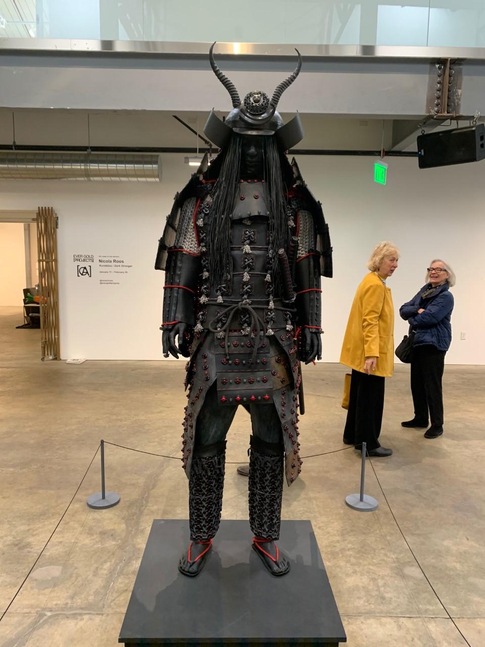
I visited the Minnesota Street Project before the shutdown and had quite a pleasant experience, it was a different style of gallery/galleries. Being an actual warehouse with resident artist and sectioned off gallery spaces, where the artist would allow another artist to show their work in a professional setting. At the main entrance of the Minnesota Street Project complex, I come across the first gallery. The entirety of the buildings’ first floor is the gallery and at the time was showing works by Nicola Roos. Spaced several feet apart and in their own little square pedestal sit life-size sculptures of what appear to be traditional samurai outfits on a mannequin. Upon closer inspection, it is clear that the figure uses life castings for the face and extremities. But the biggest shock is how the traditional samurai armor is created. Using several different materials and mixed media, the artist creates a realistic rendition of the suit of armor. Materials like bike tubes, foam, glass, beats, and rope are some of the ones used to create the attire. The more that I observe this figure the more alive it seems. The sculptures sit still but have a particular stance to them, not sitting perfectly still and straight-up but rather with a very subtle contrapposto. Frozen in time these statues have a dark, menacing feel to them. The expression on the faces of the figure is peaceful, with eyes close and a resting face. But the dark colors and heavy-looking armor create this sensation of the figure waiting to be awakened. With a total of 5 figures spread across the gallery floor, the viewer gets to sit and watch each sculpture in a personal space. Away from the other sculptures, the viewer has a complete 360-degree uninterrupted view of the piece. This contrast between the detailed dark figures and the white walls and light concrete floor place the sculptures in complete isolation and almost creates a kind of void for these particular pieces. The gallery being in the complete open center of a warehouse creates a challenging job for the artist to presents it’s work, as it must sustain itself surrounded by a continuous flow of foot traffic, this type of open space galley surrounded by more galleries within the same building was new for me but it was a quite enjoyable experience.


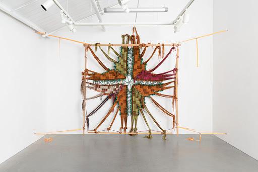
At the Elanor Hardwood Gallery, a show by Kira Dominguez Hultgren is showing. The small space is well covered by the stretched out tapestry-like sculptures. The artist has created these intricate textiles which are quite large and some even cover the entirety of the wall. The artist uses ratchet straps to stretch out the textiles across the gallery walls. At first, this was the only thing that caught my eye. My complete attention was dedicated to how the artist had displayed this work. One particular work was troubling for me as the ratchet straps where bright orange, even if they were a different color it was clear that the artist had made a decision to display the large works with this obvious method. The reasons as to why I couldn’t figure out, but for the most part it went along with the pieces as the piece itself was very organic and natural-looking. In contrast to the more rigid and geometrical look of the ratchet straps. But I kept finding my way back to the one-piece that just didn’t feel right. This particular piece had an extra element in it, wood. The long wood pieces that were part of the fabric looked like a frame. Running along the edges of the fabric woven into the entirety of the piece these wooden lines created that rigid industrial feel. But then they were also the part of the piece in which the ratchet straps connected it to the wall. My fascination for how the work was displayed may have distracted me from the overall gallery itself, but it does a good job of creating tension, and almost pointing at the stretched fabric. The intricate woven fabrics get highlighted by the neon orange straps, that serve the job of not only creating physical tension that hold the piece up but also points at it in a very direct and arrow-like fashion.


At the Nancy Toomey gallery, an exhibition by Gregg Renfrow was showing. This larger gallery had paintings in the series “Closer to the Water”. The paintings are color full, with a large variety of colors varying from painting to painting. But there’s something very peculiar about these paintings as the brush strokes or rather lack of them are very clear. The entire canvas looks like it was painted in one clean sweeping motion. The artist ha intentionally created this effect by which the different colors blend and into one clean stroke that covers the entire canvas as if they were placed perfectly all at once. The image itself shows a lot of light, using white and vivid colors the painting places a type of foreground, middle ground, and background. An abstract landscape I would call it. The images are symmetrical on each side, not perfectly symmetrical at the brush stroke pattern has its natural differences in each side but from left to right the are symmetrical in color. With a white line cutting the image down the middle from top to bottom. This dissection of the image is quite strong and creates that feeling of light. Although all the paintings vary drastically in color and use of pigments in the image with some being mostly white, all of the images are very similar in their composition. The large canvases were placed vertically and looked almost monolithic. The image is split down the middle also made it feel like a doorway. With this line that was in most painting an array of white light almost like an extremely bright sunrise, the images were creating a sensation of landscapes but in an alternate universe. Or a type of breaching into a new dimension. It also reminded me of all too familiar scene of the light at the end of the tunnel.


In the Anglim Gilbert Gallery, the artist by the name of Carter was showing work in the series “Didn’t we almost have it”. Various different images were displayed in this traditional medium size gallery. The drawings by carter where very intriguing as some would have bacteria like characters whit human facial features and expressions. While others would have repetitive colorful symbolism stamped over black and white charcoal drawings. The title is very descriptive and hints at some kind of human condition. The images portrayed back up this idea of human error or should we call it a crisis. The drawings with the bacteria like figures sticking their tongue out are kind of a mockery of the image to the viewer. While the ones whit this colorful symbol over the charcoal drawing of something traditional like a landscape or a ship at sea feel more like a representation of overtaking. What I mean is that the image is being highjacked taken over by these bright bold colors in this repetitive shape, almost like an illness spreading throughout the image. As playful as the color and placement of paint drops and streaks may seem I get a far more somber feel from these paintings. The action of painting over a specific drawing seems aggressive as it is now to be overwhelmed by color and what seems to be random symbols and patterns adds more impact to it. The contrast between the black and white charcoal painting and the bright color is huge, but it makes me wonder exactly what the artists’ intentions are for these graffiti-like patterns covering up the majestic style of drawing behind them. To be it is a progress in time from the old to the new, the traditional to the modern, light vs dark type of thing. Following this idea of the progress, I refer back to the title as it tells me that there is something the artist isn’t satisfied with. The kind of idea that tells me these works are political if not very directly talking about something that could have happened or could have changed but “we” blew it. The whole gallery was filled with very intricate and interesting images and it created a very dynamic experience when going from painting to painting, each telling their own story talking about the same concept.

Your questions about and interpretation of Carter's work are really interesting and made me think. That title is provocative. "We" might be a person addressing a former partner in a failed love relationship; or politically, or "we" might be Western imperialist culture (those ships) almost had it all (the world) but we "blew" it.
ReplyDeleteOverall this is a nice post, but it would be stronger if you added captions for the images.
ReplyDelete